The visual identity of a brand, i.e. its logo, can either make or break its importance in the eyes of an ever-perceptive consumer. We all are discerning consumers. We are naturally programmed to capture an ever-lasting image of an emotion in our subconscious.
Often, a brand’s logo signifies its products or services or even a movement. There is much importance in a logo, sometimes hidden and most of the times direct or straightforward. Whatever be the case, the end goal is to deeply engrave the essence in people’s heart and mind.
Have you ever wondered about what made some of the companies huge? Surely, the basic feat was their ability to identify the needs and develop a product/service to satisfy those needs. But if there are many players looking to do the same for everyone, what made them the people’s choice? These companies went the extra-mile and understood a deeper connection. They had one thing which others didn’t: brilliant logos!!
At least once in one of your sessions at a b-school, probably during the marketing sessions, you will come across discussions pertaining to a company’s success and its logo or branding. As future or current marketers, you are expected to imbibe that creativity in you to take a brand to new heights.
Every established brand has an intriguing story behind their logos which reflects the designers’ and marketers’ creativity, brainstorming and research to help reach the brand where it stands today.
Here are some fascinating facts about some of the renowned brands and their logos:
- GOOGLE: This had to be the first among the discussion. Whenever in doubt, ask google! Did you know that the name ‘Google’ was a result of a mistake? Initially, the company was named Backrub. It was then decided to change and name it ‘Googol’ which represents a number that is 1, followed by one hundred zeros. Thanks to the guy who misspelt it as ‘Google’ and rest is history. Ruth Kedar, the graphic designer who designed the now-famous logo said that there were a lot of different colour iterations. They ended with primary colours but, instead of having them go in a pattern, they put a secondary colour on the L which represented the idea that Google doesn’t follow any rules knows how to have fun.
A few years back, Google had changed the logo design and they said that the new logo was meant to reflect the new ways people visited Google.
- BEATS
So, the Beats logo looks pretty simple. The ‘b’ is seen enclosed in a circle; however, it isn’t just a circle, it actually represents a human using the headphones.
- EIGHTY 20
Eighty 20 is a Data Analytics Consultancy. Its logo is something that isn’t obvious to the normal eyes. The squares in the logo actually represent the binary pattern for 1010000 and 0010100. The blue squares represent the ones.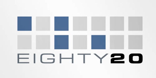
- LONDON SYMPHONY ORCHESTRA
The London Symphony Orchestra is one of the oldest orchestras in the world. Its logo represents a waveform of the letters LSO drawn at one go. But if you look closely, you can see an orchestra instructor. Do you see it? 
- A G Low Construction Ltd
This is a South African construction company with a very thoughtful logo. In a unique way, the company’s name is spelt in a way that it looks like the floor plan of a home.
- NEWMAN: Newman is a French Clothing company. Upon first look, its logo looks like the brand name just written in fancy fonts. But, if you look closely enough, the logo could be read exactly the same way when upside down. Try it!
- LG: LG is recognised worldwide with its logo simple enough with the letters L and G. But again, as a hidden element, the logo itself reveals a face. The L is the nose and the G makes up the rest of the face. (Do you know what does LG stands for? Please don't say Life's Good )
- FEDEX
FedEx is a popular shipping and logistics company, we all know it right? The logo is, again, simple and consists of just the letters of the name and the colours. But, have you ever noticed the arrow hidden in the negative space between E and X? The brand likes to give the idea of them moving forward like an arrow with speed and precision.
- US Cyber Command: Government Organizations are important to not just one’s country but to others as well. For a govt. as important as the United States Cyber Command, having a hidden aspect isn’t surprising. It is not easily noticeable but upon close inspection, the golden ring has a code: 9ec4c12949a4f31474f299058ce2b22a.
What do you think of this? This is not rubbish. It was cracked by a threat researcher and it was the MD5 of their mission statement. MD5 is a 128bit cryptographic hash used to verify file integrity.
- TOBLERONE: Who isn’t aware of this chocolate brand and I am sure the mountain shapes come into our minds on hearing the name. The mountain in the logo symbolises the Matterhorn Mountain in Switzerland. The hidden aspect though is a bear, symbolizing the unique honey flavour found in the chocolate and the fact that the chocolate is made in the ‘City of Bears’.
These are some of the brands that not only leave a mark on people but also gives them something to remember by. Were you surprised by some of these creative signs of brilliance? How many of them were you aware of?
The next time you come across a logo, whether it's completely new or known to you, try to have a closer look. You may be pleasantly surprised by what might lie in front of your eyes.


Comments