Logo Evolution:
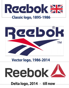
The new Delta symbol which resembles to Delta Airlines or Google Drive logo, replaces its "Vector" logo, which was introduced in 1986 as part of Reebok’s first ever rebranding. Prior to this, Reebok had used the same logo containing the Union Flag since the 19th century. Reebok has revamped its brand identity to appeal to consumers pursuing for "a fuller life" through fitness.
In the new logo, three independent blocks form a triangle which represents the physical, social and mental changes that result from fitness. This repositioning as a patron of health and exercise is part of its strategy to change the brand image from its existing professional athlete association’s image.
During the launch, Matt O’Toole, its chief marketing officer, said: "The new brand mark signals a clear purpose for our brand and it will be a badge for those who pursue a fuller life through fitness. We believe the benefits of an active life go beyond the physical benefits and impact your whole self and your relationships with others. It is our symbol of change - an invitation to take part, and to unlock your true potential. It's not a logo; it's a symbol, a way of life”. From past 3 decades Reebok is making products for elite athletes in every imaginable sport, but was unable to inspire enough people. This new avatar is to invite everyday people not just stars or superstars.
With this rebranding, Adidas is optimistic to reposition Reebok as the brand of choice for consumers "embracing a fitness lifestyle".
Adidas and Reebok:
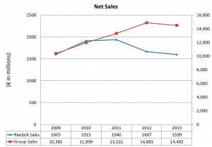
This new logo is an attempt to bring Reebok out of its struggling condition. Adidas acquired Reebok in $3.8 billion in 2006 to gain the market leader position. From the financials, one can identify that Reebok growth is less compared to its parent company.
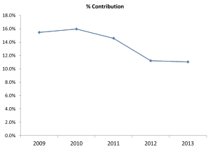
Once you analyze the net sales of Reebok and Adidas group in the last 5 years, you can find that Reebok is losing its market while other brands are doing comparatively better. Even in terms of % contribution to group sales, you can establish that Reebok has lost its contribution from 15.4% to 11% in 2009-13. Without Reebok, Adidas could achieve an operating margin close to 11% of sales in 2013, said Riemann, analyst at Commerzbank AG in Frankfurt (April 2014). Reebok is still unprofitable before interest and tax.
“Our communication focus is almost exclusively on the performance angle” said Herbert Hainer, CEO Adidas. To promote recovery of Reebok, it will continue to add new products in its portfolio. New product line includes CrossFit apparel which uses baremove+ technology that makes the wearer feel like they are naked when exercising, said Katja Erbe, brand director for Reebok.
Reebok is the only brand that is offering CrossFit-specific products like shoes and specific textile for apparel. CrossFit delta logo selection will help the company to acknowledge the potential gain from exploiting a top-selling Reebok product. CrossFit product contributed 13% of total revenue of Reebok in the Q1 2013. “The new logo will allow them to give their entire fitness category a new boost,” said Gauthier Boche, associate strategy director at the London-based brand consultant Lothar Bohm Associates Ltd. “It’s the right time to do so because they are surfing on CrossFit’s wave of success” he further added.
The Competition Nike vs. Reebok:
Nike and Reebok have similar shoe designs and ideas and even similar target audience. Then how will these two brands distinguish themselves in market? The answer can be that they are trying different media and communication strategy to differentiate from each other. Reebok is using rhetoric techniques to fill the gap between a leader and challenger. Since the products of Nike and Rebook are very similar, they have to rely on head to head competition. Many of the Reebok products are closely resemble to Nike’s products, hence its lack of uniqueness in design hurts the brand because there is no extra utility for a consumer to prefer a challenger over a leader.
After Delta logo launch, the positioning of Reebok is
Target Audience: Anyone who is capable of doing exercise
Age Group: No defined beginning or ending
Differentiation: New innovative product with multi vibrant color
Logo Significance: Displaying a great deal of informational reasoning
This rebranding would give Reebok a chance to revamp it once again. Will it really change its face or will it be able to connect with consumer? We don’t know the exact answer but the upcoming days will surely tell the real story. We just have to wait and watch.
Source
http://famouslogos.net/reebok-logo/
http://www.ensltd.com/blog/the-sports-marketing-show-recap-02052014
http://adage.com/article/news/change-reebok-logo-shift-pros-crossfit/291923/


Comments