Material Design was much more easily absorbed into dev community, the interactions were much more fluid and easier to understand & even designing an app was much simpler now. And it also made the whole Apple Skeuomorphism look, very stupid as Material Design felt like the real deal.
Now that Material Design has really established and made its mark, working backwards on a design from there on shouldn’t have been a big challenge. Apple taken flat seriously, made itself a simple grey apple logo and also redone the website. Microsoft applied its tile design to all its office and OS products. Google’s somehow managed to go back on that, as it doesn’t seem to work well with Material Design. They don’t feel from the same family. So that must mean, Google must have a new design philosophy?
Where is the new design philosophy?
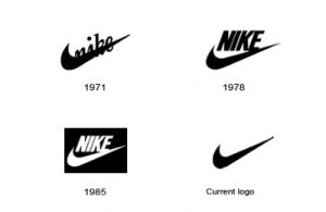
Good brands are filled with narratives and engaging stories. When people buy brands, they buy stories. The align to the hero or the geek. They relate to them emotionally. They aspire to be them. And hence both, design (representation) and the story should go hand in hand. Or there should be some continuum to the whole picture. When you see a Nike logo, you remember that it gone through several transformation and slowly become ‘just a’ swoosh. You would want to remember Coke-Cola as well for that. They are known for their brand value. For google, that isn’t coming through. Apple’s design story that they produced when they switched to flat design was with the intention of removing unnecessary to pave a way for the new and innovative. Google’s video shares the brand story but not the design philosophy.
Brands don’t need a reason to do a review or a rebrand. They can do it if they have to, for no big reason. But often, as a practice it is better that they do it when they have something big to tell and align the story to the brand logo or language. It is an opportunity to talk about a transformation, a change in the organization, a new perspective you would want your customers to have of you. And visually align to it. When Apple did its logo back in 2000s, the Steve Jobs' era was just starting. That marked something for that brand then. Apple wasn’t doing too good before that point either and has very bad investments in design. Google has good investments and already a ready design asset being used, this just looks like a step-down. Alphabet is starting off, this could have been that story.
As an independent design, it's hardly much to look to. Its good but its not great. Marks change but could be nothing at all too. But looking back at the iconic Google logo vs the yahoo like resembling one that comes out, younger and jumpier… makes me wonder what's Google aiming to be.
I would want to leave with this thought, that Google now essentially is just a tech mobile company and alphabet will take on the larger visionary channels under it. So, as a larger multi-national tech giant, what is the change reflecting?
------
About the author: Francis has worked in various startup at various stages of inception and also has been involved in the innovation groups through service design and design thinking over the last 5 year. He currently runs a small information design studio based out of Bangalore. He is also a visiting faculty at NIFT.
You can connect with him on LinkedIn here.


Comments